 |
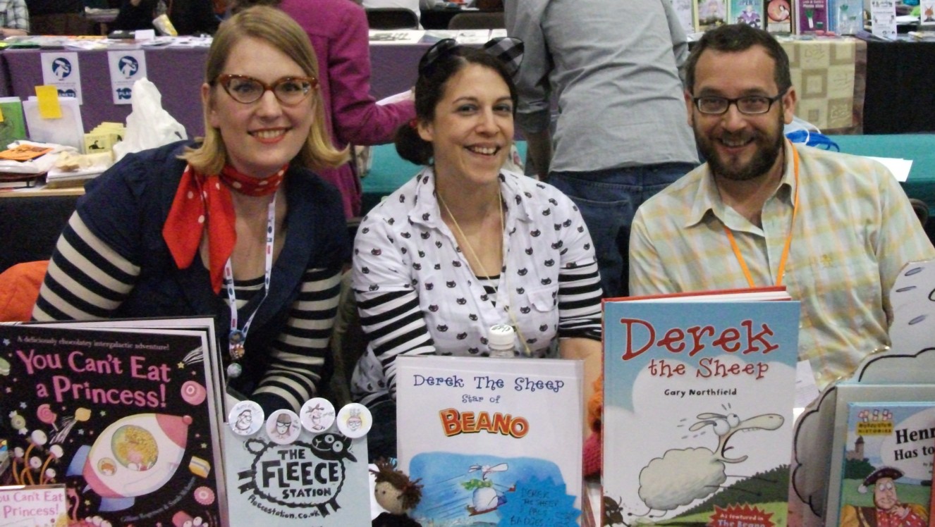
| Sarah McIntyre (left) with the 'Fleece Station' creative crew - Lauren O'Farrell and Gary Northfield - at MCM London 2010. Photo: Jeremy Briggs |
Cartoonist and illustrator Sarah McIntyre first came to Matthew Badham's attention via her Vern and Lettuce strips in weekly subscription-only comic The DFC. Since then, like many others, he's been following her work both online and in print. She's a fantastic artist whose mini-comics never fail to make us smile.
In this interview, Sarah talks about her art education, the links between comics and picture books, and why she sees a healthy future for the British comics scene...
(This interview is also being cross-posted on the Forbidden International blog)
downthetubes: Are you a formally trained or self-taught artist?
Sarah McIntyre: A bit of both, really. A very kind art teacher give me after-school oil painting classes, starting when I was five. I spent the next six years mostly painting kittens, puppies and rather tedious landscapes, but it made me love mucking in with paint. My high school art teacher was also great in that she didn't make me follow the class assignments, just let me set my own projects and get on with them, even if I had to stay through lunch break or after school.
 |
| Sarah and a 'slightly dotty' Hungarian |
I also took a few oil painting classes from a wonderful and slightly dotty Hungarian woman who collected filing cabinets full of dead crows that had been run over on the road in front of her shop, so we could draw them.
I didn't think I could earn any money doing fine art, so I studied Russian at university. But in the United States, we have this great option of completing a 'minor degree', which is half a regular degree, so I did my minor in History of Art. And the professors there let me fudge the requirements a bit so a lot of that time was spent drawing life models in the art studio instead of memorising slides.
Before my last year of university, I spent two years in Moscow, running around its galleries and museums, teaching myself a lot about Russian painting and its arts and crafts movement at the end of the 18th, beginning of the 19th century. Until I realized I couldn't live on the pay of three dollars an hour, I worked in the Moscow branch of
Shakespeare & Co bookshop, and we hosted these marvellous arts evenings where I got to meet loads of fascinating painters, sculptors, writers and poets, and occasionally I'd get to see their studios.
I spent several years working as an illustrator, just taking a few evening classes here and there. My favourite short course leader was Elizabeth Harbour, who set loads of brilliant little book projects, similar to the kinds of things you see at small press fairs now. She's the one who got me set on the path to making full books, not just drawings.
 |
The Bottle - art college
work by Sarah |
About five years after moving to London, I enrolled at Camberwell College of the Arts to do my Master's degree. I was lucky, it was the first year Janet Woolley began leading the course, and it was still small, only 14 students. (I think it's over 50 now). Jan combined being a total powerhouse with being quite mumsy; she really cared about the people on her course and looked after us at the same time as pushing us hard and being utterly frank with us.
What I didn't learn on that course, I was able to pick up from the
Association of Illustrators Business Start-up classes and seminars led by the
Society of Children's Book Writers & Illustrators. And Ellen Lindner, who was on my course [and who now edits the anthology,
Whores of Mensa], started me off learning about comics, pointing me to the kind of comics I actually liked, not the kind I'd seen when I walked into mainstream comic book shops.
I think it wouldn't have been too difficult to slide through the course without doing much; I tried to come up with at least one piece of artwork every day and I think that decision made all the difference. I only felt I'd made my first real breakthrough about a week before the final show. Jan and the Graphic Design leader actually let me set up a second, separate show in the hallway because my work had changed so dramatically between the stuff I'd carefully printed up for the exhibition and the artwork and comics I'd been doing in the meantime.
downthetubes: So when did you actually start making comics?
Sarah: When I was about eight years old, I used to make a magazine called
Family Favorite and leave it on my neighbours' doorstep, ring the bell and run away. I think the first comics I ever made were for that magazine, and they were copied, possibly even traced, from Archie comics. But all the comics I ever read in the
Seattle Times or
Archie seemed to have funny punch lines, and I didn't think I would ever be able to do that. And I read a few of my mother's stashed-away story comics (Jack London's
White Fang, a couple fairy tales) but they were so old and brittle that I didn't think people still made them. I didn't even connect them as a storytelling medium with the funnies in the newspaper. In fact, the linework and colours looked so polished to me that I never even thought about real, live people making them at all. Maybe I thought they grew on trees or something.
 |
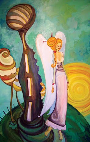
Comic created at college
by Sarah |
I think my first comic was a little book I made for my dad for his birthday, telling his life story from my point of view. It was more of an illustrated book that a comic, but if would have fit in with minis you see at small press fairs.
My first comic I made at art college was a double-page spread about some yobs throwing a beer can into the Thames and then the river bursting its banks to take revenge on everyone. Ellen gave me some good tips on it and it made me start thinking more seriously about making comics.
I read a book called
On Sight and Insight by John Hull about the experience of blindness and thought I'd write a graphic novel with a character in a soundscape environment, simulating blindness, but in a visual way, using typographical artwork. That subject was
way too big for me at the time and I had to shelve it. I also made a couple travel minis and took part in an online comics jam with some people on LiveJournal.
Then the opportunity came up and I cheekily promised David Fickling I could do a page a week of comics for
The DFC. I practically had my fingers crossed behind my back when he asked me if I could do it; I had absolutely no idea if I could, and I sweated bullets. But I approached
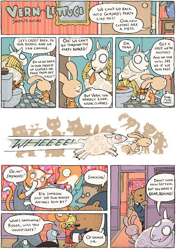
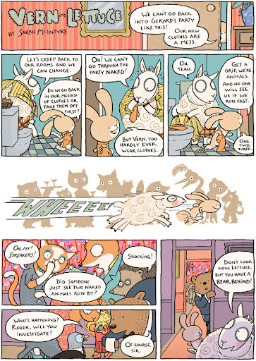
Vern and Lettuce like a children's book, just drawn within panels instead of pages, and the editor didn't ask me to stop, so I figured it must be okay. I was overwhelmed when people started telling me they liked it.
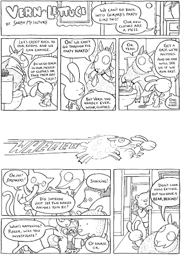
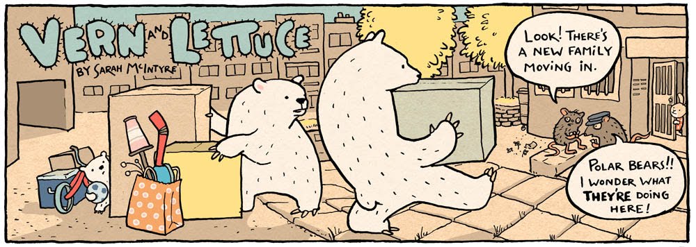
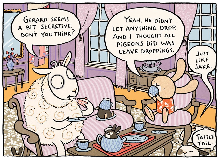
 |
| Vern and Lettuce by Sarah McIntyre |
downthetubes: What did producing Vern and Lettuce, a weekly comic, teach you in terms of making comics and also the business, deadline, discipline side of being a comic artist?
Sarah: I was already used to deadlines and discipline from making picture books, although I still had a lot to learn about the business side of things. When I started with David, I was approached by one of the best agents in the business and she's made my work phenomenally less stressful.
In terms of making comics, I'd never submitted more than a few single illustrations in digital form, and I still had a lot to learn about Photoshop. I still only really know what I need to know, but I try to keep things simple by sticking as closely as possible to the methods of traditional printmaking.
For
Vern and Lettuce, I tried to think of the layers in Photoshop as the layers in a screen print, one layer per colour. I hate the overly slick, airbrushed effects and gradients so many people rely on in Photoshop; it often it makes beautiful linework look like cheap pizza flyers, or makes everything look muddy. But I love the imperfect, slightly textured look of hand painted signs, and I saw some gorgeous revolutionary posters in Moscow in places like the
Mayakovsky Museum. They owe a lot of their visual power to the fact that the painters didn't have many colours of paint, they just made do with two or three tins. With Photoshop, I can access millions of colours, but if I just stick to a few, my work looks so much better.
There's a lot of experimentation in
Vern and Lettuce with this; I was very strict with myself in the first few pages, then I started to introduce more and more colours until about episode twelve, when I got frustrated and reined in my colour palette again.
Writing was also difficult, the relentless pace of the weekly deadline. In the beginning I had a few weeks to play with, but then I took a holiday and after that, I was finishing bang on the day the strip was due for print. There's this tricky thing, just like in picture books, where there's supposed to be a sort of 'flip' at the end of the story. It can be a joke, but it doesn't even have to be funny, just something to give the strip closure and make the reader look at things a bit differently.
A lot of the other
DFC people I talked to started their stories with this end point in mind, but I never did. My way of working was just to put
Vern and Lettuce into a situation and see where they went. They're so real to me that I can hear exactly what they'd say to each other. And sometimes they defied tight little endings, they still weren't very domesticated animals.
A few times they got me into a real panic and I'd ring up my
DFC colleague
Woodrow Phoenix, who lives nearby. He would patiently look at where my strip had gone and then walk me through to the end of it. It's been the same working in a studio with
Gary Northfield; it's shown me that endings aren't magic, that much of the job just requires focusing and taking things to their logical conclusion, and then one step beyond. I think it's the ‘one step beyond’ that looks like magic to the rest of us. (I think
DFC artists
James Turner and
Jamie Smart live in the land of one step beyond.)
Doing comics jams with
David O'Connell also helped me get my writing out of terrible ruts. In a comics jam, I can't get pig headed about where a strip is going; when I hand the next page over to Dave, he always takes it in a direction I would never have dreamed up. When I get his page and start on the next one, it's almost like a completely fresh story.
That really helped show me that there's never one solution to telling a tale, the permutations are infinite, and when I'm stuck, instead of blundering on with something dull, I can step back and send the story flying in a completely different direction. And writing with friends makes things more fun.
Vern and Lettuce were great to me that way, in introducing me to so many amazing comics friends who know how to combine hard work with being a bit silly.
downthetubes: Can you give me a couple of examples of 'flips' from your own work?
Sarah: Well, things such as the raisins in Vern's cake ingredients, which turn out to be something much less palatable. Or the little stowaway moles that parade out of the airship, just as Vern thinks he's going to get some peace in his park keeper job.
 |
| Comics jam work with David O'Connell |
downthetubes: You make comics and picture books. What's the difference between the two? Is there a difference? Is any distinction arbitrary, they are, after all, both collisions of text and art? What do picture books do well that comics don't and vice versa?
Sarah: This is a huge subject, I can do long workshops on the answer to this, and it needs me to show lots of visual examples. But I was amazed with
The DFC, at how smoothly I could transition from picture books to comics. In the old days, a lot of picture books had very simple formats: a picture, possibly in a box, with text underneath. But there’s more of a move to vary formats in picture books now, and make the text intertwine and work with the pictures. I’ve always liked doing this, and never wanted to leave it solely to the book’s designer.
Often in picture books, you’ll see several small images on a page, which picture book editors would call ‘vignettes’, and comics people would call ‘panels’. Many picture book people (Russell Ayto, Mo Willems, Posy Simmonds, Raymond Briggs, Satoshi Kitamura, loads of others) have been using comics formats for years, even if they wouldn’t have called it that, or wanted you to call it that. I remember the surprise of learning that Maurice Sendak’s 1970 book,
In the Night Kitchen, was a direct tribute to Winsor McCay’s
Little Nemo in Slumberland. I always knew it as a picture book, but of course, it’s a comic, too, and a love letter to comics.
I don’t think there has to be any boundaries between picture books and comics. I think they can flow into each other entirely seamlessly, and keep people developing their visual literacy well after they’ve moved on from reading only children’s books. And it lends added sophistication to children’s books, when kids can read a book that’s slightly above their level without it being a huge break from picture books to text-only novels.
I think this merging needs two things to happen: Editors need to overcome their prejudices against books looking too much like comics, or ‘cartoony’ (a damning adjective in an editor’s office). And I think this is happening, as they realise there’s a market, and librarians go nuts trying to get their hands on these books that ‘reluctant readers’ will pick up. (You can see this happening with picture book publishers such as David Fickling with his DFC Library, Walker Books, a bit with Templar; and even more so in the USA with Toon Books, Scholastic Inc and others.) Some editors are starting to warm up to speech bubbles, as a clear and vibrant way of showing who’s talking on a page.
Children’s magazines such as
Okido and
Anorak are just getting on with it and making lovely non-traditional, kid-friendly comics. And some publishers are tentatively starting to experiment with publishing adult picture books, such as those by
Audrey Niffenegger
(although she had to prove herself first with a text-only novel).
It’s essential that comic fans do their best to let people know about the new books they love, so we’ll get a chance to see more of them. Write reviews, blog about them, make as much noise as you can.
The second thing is that comic creators need to go visit the children’s book sections in shops, see what’s happening right now in publishing, and accept that some stories can be told without having to rely on sexual clichés, excessive violence or bad language, and that it doesn’t make them a wimp for writing these kinds of stories.
(I keep hearing comics people saying ‘I’ve got this amazing character, who fights
this character, it’ll be awesome!’ And that’s their whole story.)
I think sometimes people switch into a different mode when they’re writing for children, they get very patronising, clichéd, or even boring (because their adult comics rely on sex or cheap shock tactics and they suddenly can’t use them). Or they over-egg the pages with so many high-impact graphics that there’s no resting time for the eyes and it’s hard to read. There’s nothing wrong with a comic that has a single panel on a page.
I think simpler formats with less panels may be a way forward for making comics for children. Astrid Desbordes
Reflections of a Solitary Hamster does this well: sometimes a single panel, sometimes two, three or four panels, but the large pages have plenty of breathing space.
Kids like clear stories with solid plot lines and well-developed characters they can relate to. I believe, if you can write an excellent story for children, adults will like it just as much as the children. I think it was Philip Pullman who said something about the difference between kids books and adult books: that adults remember what it was like to be kids and can relate to the experience, but kids have no idea what it’s like to be adult yet, even though they wish they could. So you need to keep that in mind if you’re writing about adult characters or including adult conversations in a children’s book, don’t talk over their heads. You can have more than one story going on a page at the same time, but the simplest story always needs to be the best one, don’t neglect it for subtext.

In terms of format, picture books tend to be shorter, full-colour, and better paid for the amount of work put into them. You might earn as much for a 32-page picture book as a 200-page graphic novel. Which means the picture book editors will scrutinise each page in much more depth. As comics get more popular (and I don’t doubt that they will), hopefully publishers will raise their payments for comics, but it may take the best comic creators getting good agents, or really learning hard negotiation tactics before this happens.
downthetubes: What next for Sarah McIntyre?
Sarah: A week after
Vern and Lettuce comes out, I’m launching another picture book with the writer Anne Cottringer, called
When Titus Took the Train. (You might recognise one of Anne’s other books,
Eliot Jones, Midnight Superhero). The editor and designer said they really wanted me to illustrate it because of my ‘comic sensibilities’.
I originally thought they wanted it in comics format, but it’s more of a straightforward picture book. But there are bits of comics creeping in from all sides. Woodrow lent me some of his Western comics, such as
Bat Lash,
Buffalo Bill and
Johnny Thunder so I could get into the wild frontier swing of things.
The story’s about a kid named Titus who goes by himself on a big train journey, which gets more and more fantastical, so it’s not entirely clear what’s really happening and what he’s imagining. Bandits, white water canoeing, a T-Rex… actually, Gary helped me with the dinosaur because mine wasn’t looking nuts enough. I thrust a post-it note across the studio at him and begged, ‘Gary, please please will you draw me a T-Rex?’ He scribbled something in two seconds that was just
perfect. So you might notice that my dinosaur looks an awful lot like Gary’s
Derek the Sheep. (I call him Derek the Dinosaur. It’s one of my favourite spreads.)
downthetubes: Who would you like to big up, comics-wise, on both the small press and the pro' scene?
Sarah: I’m constantly amazed by the pictures
Warwick Johnson Cadwell keeps making. Such amazing line work and colouring, and he looks every part the boat captain that he is. (I’m a bit smitten with him, can’t you tell?) He contributed to the first
Birdsong anthology, and I’m also keenly watching the work of another contributor (and one of its editors),
Will Kirkby. He also has gorgeous line work, and I’m hoping he takes his more epic, Japanese influenced tales and turns them back to his hometown in Sheffield to tell more personal stories. (But that’s just me, we’ll have to see where he goes.)
Darryl Cunningham is on a roll after launching his hard-hitting novel Psychiatric Tales.
Viviane Schwarz is working on a marvellous sheep comic with Walker Books and she’s posting its progress on her blog.
My three studio mates at the Fleece Station,
Gary Northfield,
Ellen Lindner and
Lauren O’Farrell all have amazing projects up their sleeves at the moment and we all joined together because get so excited about each other’s stuff. We all work in slightly different areas, and I think some great thing are going to happen in the places where our creations cross over. And
the DFC Library crew are making magic, I’m so excited by the books they’re putting out.
I think Nikki Gamble, who heads the
Write Away website and huge picture book review database, is very hot on comics for children and teenagers, and sharing them across the country with teachers and librarians. So I’m hoping we’ll get a lot more comics in front of kids with the help of people like her, Paul Gravett and others, and the industry in Britain will make even more business sense to publishers and booksellers and really take flight.
• There are more details of Vern and Lettuce on the DFC Library website (along with sample pages) and also on the David Fickling Books blog.
• Sarah McIntyre also has more details of the book on her website and her blog.
• Our review of Vern and Lettuce will be published on 30th September, just as it goes officially on sale

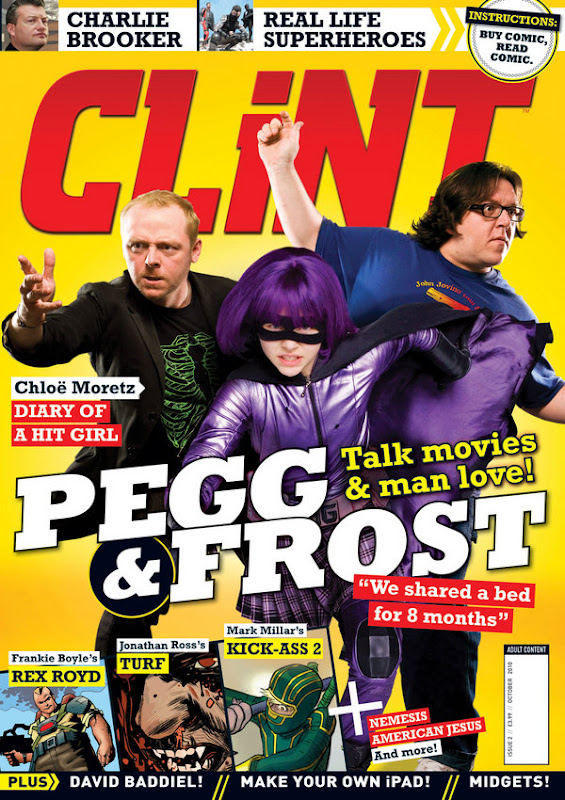 The second issue of CLiNT, Mark Millar and Titan Magazines' British news stand anthology, mixing comics with a range of features that include a focus on 'real-life superheroes' and an interview with Charlie Brooker, is a much-improved mix on the launch issue.
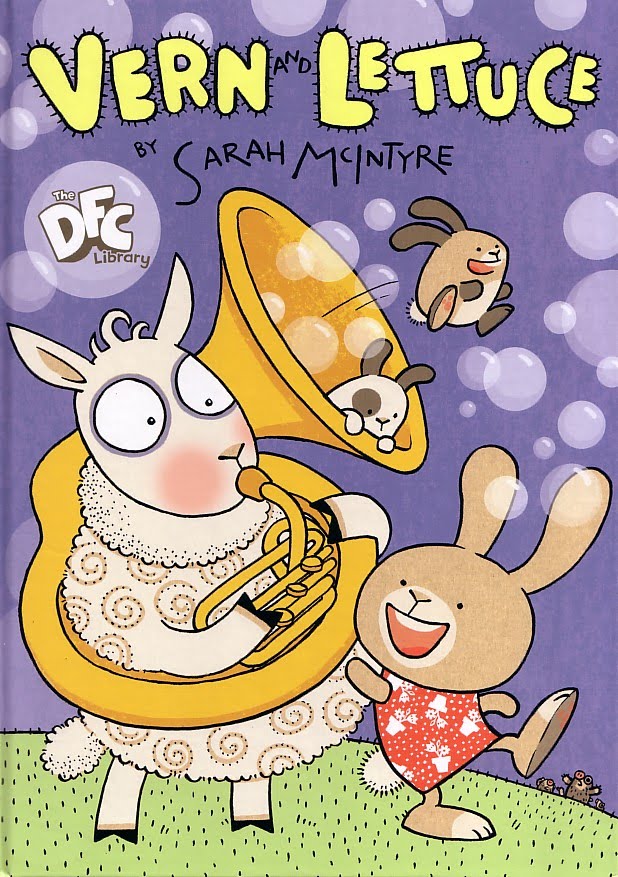


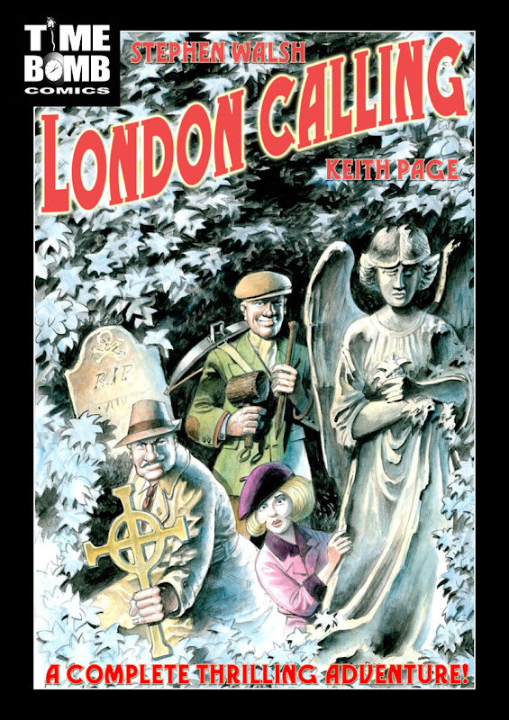 Time Bomb Comics has confirmed their next release, the graphic novel London Calling, will be launched at the British International Comics Show next month (October 2010).


